Get in touch
© 2025 Doodlo | All Rights Reserved | Terms of Use | Privacy Policy
Color Theory Design : The Art and Science of Choosing Colors
We often find ourselves mesmerized by the beauty of nature, the vivid greens of trees, the deep blues of the sky, the warm hues of a sunset, or the calming flow of a river. These landscapes captivate us, not just because they’re visually stunning, but because their colors stir something deep within us. That’s the fascinating connection between colors and psychology in our daily lives.
Some colors feel soothing, while others might make us feel restless or even irritated. This isn’t magic or coincidence, it’s the power of color theory design in action. Whether you’re a designer, an artist, a marketer, or just someone trying to pick the perfect shade for your living room, understanding how colors work together can help you create visuals that catch the eye, evoke emotions, and tell compelling stories.
In this blog, we’ll break down the basics of color theory, explore the color wheel and its role in design, dive into colour reading the emotional impact of color and share practical tips to help you use colors effectively in your own projects. Let’s get started!
What is Color Theory Design?
In simple terms, color theory design is the study of how colors interact, and how we can use them to create visually appealing and effective designs. It’s a mix of art and science, helping us understand which colors work well together, how they affect our mood, and how they can communicate meaning.
Think of it like a recipe, just like you wouldn’t mix random ingredients in a dish, you don’t want to combine random colors in a design. Color theory helps you find the right “ingredients” or hues for your creative projects.
The History of Color Theory
The roots of color theory trace back to the 17th century when Sir Isaac Newton first studied how light refracts into a rainbow of colors.
The color wheel, a tool that established the basis for understanding color connections, was developed as a result of his discoveries.
Today, color theory design is a key principle in fields like art, design, and marketing, helping creators use colors with purpose and intention.
Understanding the Difference – Hue, Shade, Value, Tint, Tone, and Saturation
When working with colors, it’s easy to get overwhelmed by terms like hue, shade, or saturation. But these concepts are key to creating balanced, visually appealing designs.
Each term helps us understand how colors behave, how they can be modified, and how they impact a viewer’s emotions. Let’s break down these fundamental terms to see how they shape the world of color theory design.
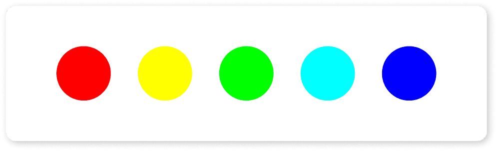
- Hue: The pure form of a color like red, blue, or yellow without any black, white, or grey added.
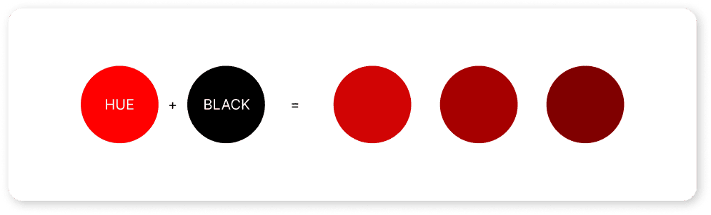
- Shade: A darker color produced when black is added to a hue.

- Value: A color’s perceived lightness or darkness affects its visibility and mood.
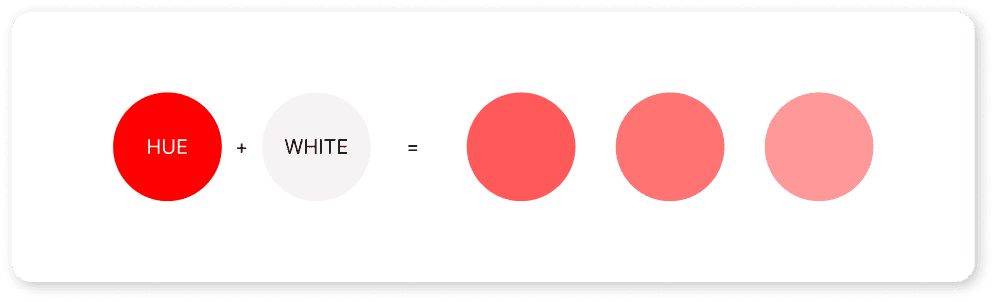
- Tint: A tint that is made lighter and more pastel by incorporating white into it.
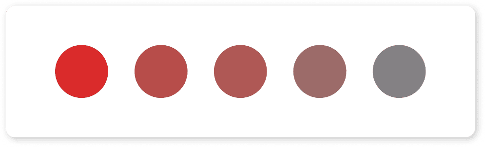
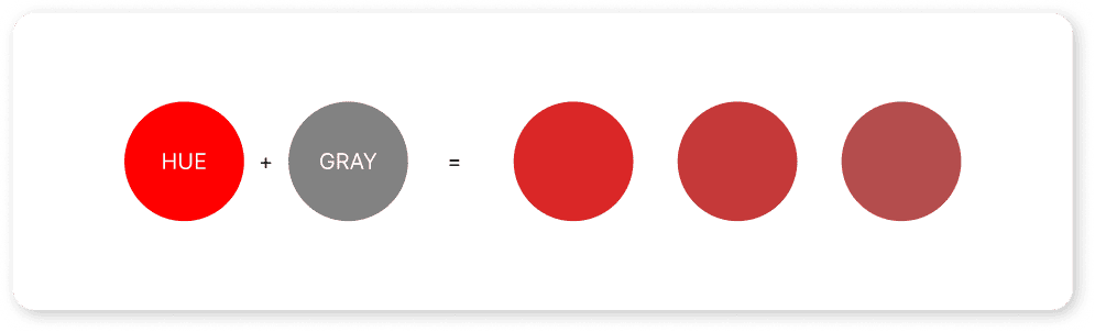
- Tone: Made by adding grey to a hue, softening its intensity and creating more subtle shades.
- Saturation: The naturalness or power of a color can be clarified by saturation, a high saturation level denotes a vibrant hue, while a low saturation level denotes a subdued one.
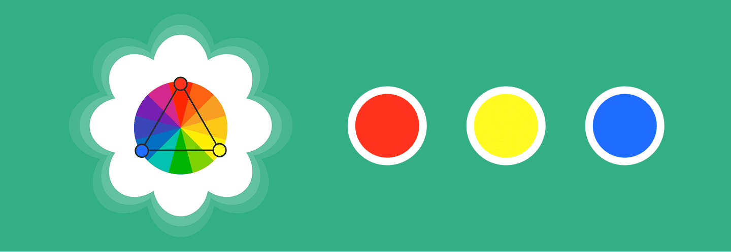
The Color Wheel – Your Go-To Tool for Color Harmony
Ever wonder how designers pick the perfect color combinations that just work? That’s where the color wheel comes in!
This simple yet powerful tool helps you understand how colors relate to each other, making it easier to create balanced, harmonious designs. Whether you’re designing a logo or decorating a room, the color wheel is your guide to creating visually appealing color schemes.
At its core, the color wheel arranges colors in a circular format, showing how primary colors (red, blue, yellow) mix to form secondary colors (green, orange, purple), and how these mix further into tertiary colors. Here’s how it helps:
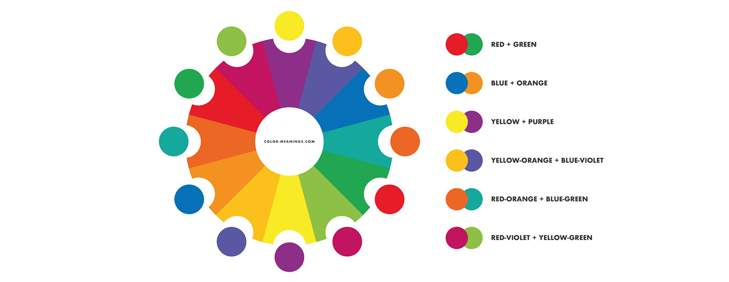
- Complementary colors: High contrast and energy are produced by colors that are opposite one another on the color wheel, such as orange and blue.
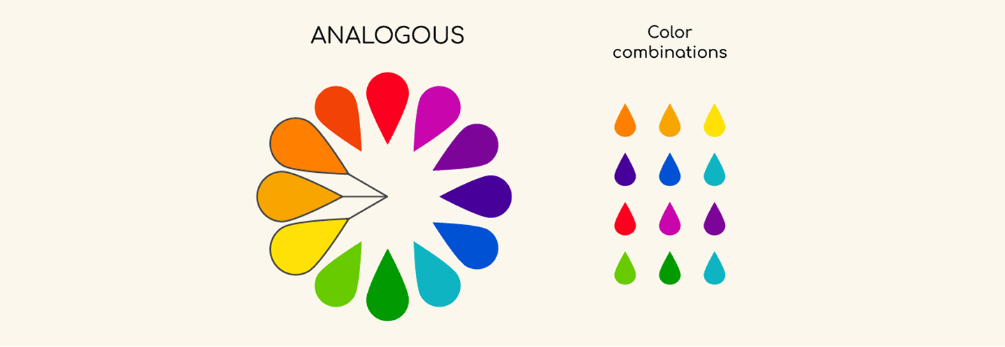
- Analogous colors: Colors next to each other (like blue, teal, and green) give a harmonious, calming vibe.
- Triadic colors: Three evenly spaced colors (like red, yellow, and blue) offer a vibrant, balanced look.
The color wheel is an essential guide for anyone working with color whether you’re designing a brand, an artwork, or a website. It helps you pair colors effectively, ensuring they look good together and evoke the right emotions.
The Secret to Beautiful Combinations with Color Schemes
A color scheme is a set of colors that work well together based on their relationship on the color wheel. Choosing the right color scheme is key to making your designs look cohesive, visually appealing, and emotionally engaging.
When you use a color scheme thoughtfully, you create balance and harmony, making your design more professional and easier for the audience to engage with.
Here are some popular and widely used color schemes:
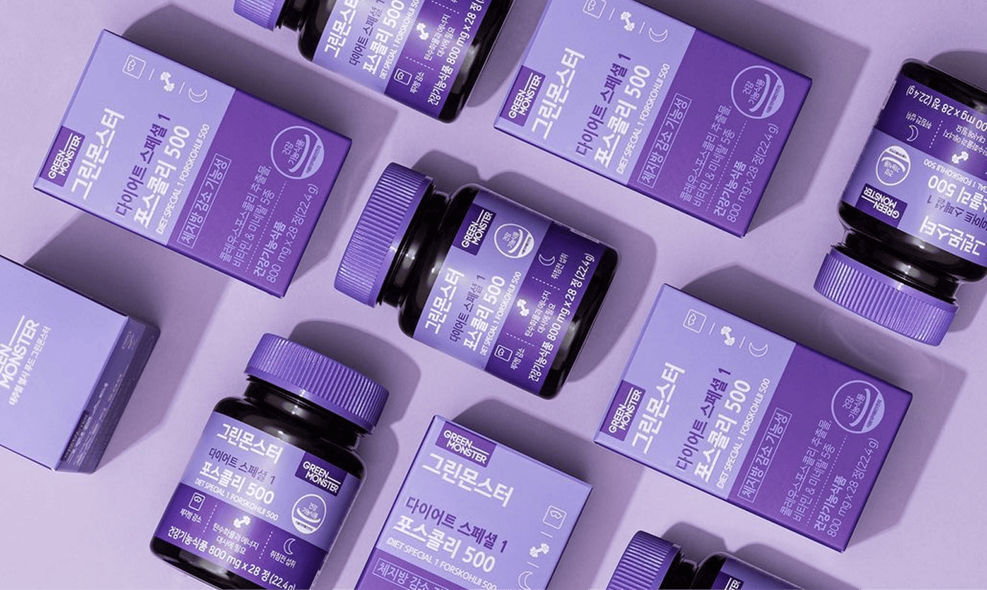
- Monochromatic: Several tints, hues, or tones of the same color can be utilised in this design. It creates a tidy, simple, and consistent look. Such as using a range of blue hues in a website’s design might convey tranquility and constancy without being overbearing.
- Complementary: Red and green or orange and blue are great for creating bold, high-contrast designs that grab attention.This combination of colors that are opposite each other on the color wheel. However, use complementary schemes with care, too much contrast can feel harsh if not balanced properly.
- Analogous:Analogous combination of colors are right next to each other on the color wheel, such as orange, yellow & yellow orange, which creates a sense of tranquility and natural flow, in them just like sunset blending from yellow to red.
- Triadic: Three hues, such as blue, red, and yellow, are uniformly distributed around the wheel in a triadic scheme. This blend preserves equilibrium while providing a lively, energizing vibe. It’s often used in branding, packaging, and playful designs where you want diversity without visual chaos.
- Split-Complementary: The complimentary scheme of colors has been twisted in such a way that the two colors next to its opposite on the color wheel are used, along with a base color. It is adaptable and easy to employ since it provides contrast without being as strong as a direct complimentary scheme.

- Tetradic (Double Complementary): This scheme uses two pairs of complementary colors, forming a rectangle on the color wheel which are red and green with orange and blue. Although it offers a wide range of colors, it must be carefully balanced to prevent overpowering the spectator.

- Square: Similar to a tetradic scheme, a square scheme employs four colors that are evenly placed on the color wheel. This approach offers vibrant diversity while maintaining balance, making it ideal for playful or dynamic designs.
Therefore, by understanding these different color schemes, you gain the tools to create designs that feel intentional, visually appealing, and emotionally engaging. Whether you’re working on a website, a poster, a logo, or your home decor, mastering color schemes can elevate your work and make a lasting impression on your audience.
Color Temperature – What are Warm vs. Cool Colors
Color temperature refers to whether a color feels warm or cool, and it plays a huge role in the mood of your design.
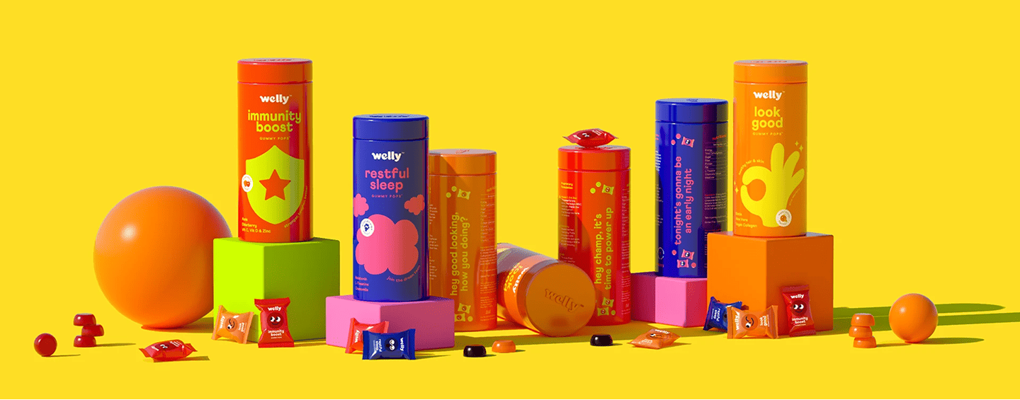
- Warm hues like orange, yellow, and red invoke feelings of energy, excitement, and comfort. They are excellent at producing striking, eye-catching patterns.

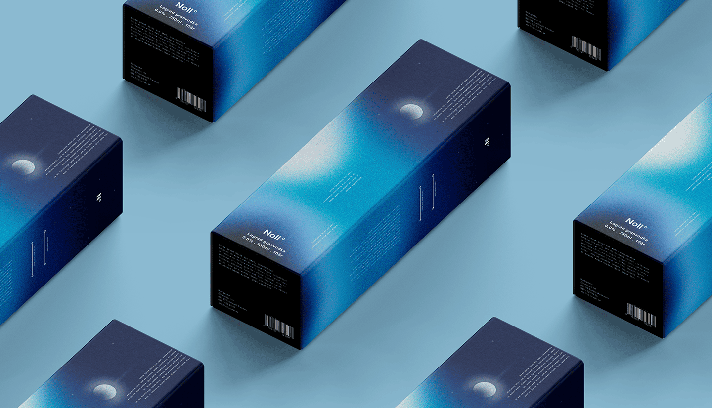
- Cool colors (like blue, green, and purple) give a sense of calm, relaxation, and trust. They are perfect for designs that require a calm yet polished feel.

Creating the ideal mood in your designs requires striking a balance between warm and cold hues. Think of a cozy living room with warm tones or a calming spa ad with cool colors. Color temperature helps you tell the right story.
Why Understanding Color Schemes Is Essential for Every Designer
Since colors are more than just aesthetic and to give a life to your designs, they also tell stories, create emotions, and influence the emotions of the observer, so it is essential to comprehend color schemes. Selecting the ideal color scheme enables you to produce designs that are balanced, deliberate, and visually pleasing.
For example, a similar scheme might produce a calming, harmonious atmosphere, while complementary colors can highlight important components. Your viewers may become confused by designs that lack a distinct color scheme since they may appear disorganized or amateurish.
Understanding color schemes enables you to express ideas more clearly and distinguish your designs in a crowded market, whether you’re creating a website, brand identification, or even a living area. It’s a straightforward yet effective method of producing visual impact.
The Power of Color Theory in Design
A thorough understanding of color theory is essential for everyone who intends to produce visually striking content, not only designers. Knowing how colors interact and arouse feelings may help you create purposeful, powerful designs that genuinely engage your audience, whether you’re creating a logo, a website, or interior design. Want color-perfect designs that connect with your audience? Reach out to Doodlo Design Studio for data-driven, impactful design solutions!