Get in touch
© 2025 Doodlo | All Rights Reserved | Terms of Use | Privacy Policy
The Psychology of Color in Branding
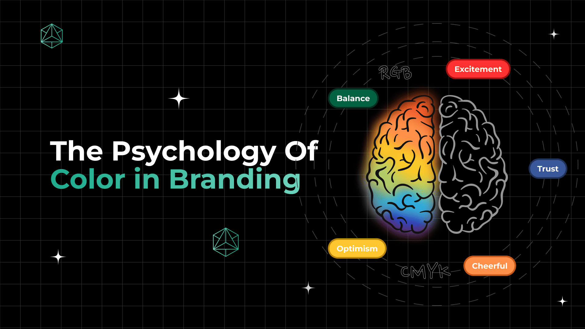
Color does more than make things look pretty, it communicates psychologically, instantly, subconsciously and powerfully. Color is one of the most strategic parts of branding strategies one can use since it can elicit feelings of trust, urgency, elegance, or even hunger.
In this informative blog, we’ll break down how colors play an important emotional and psychological role. Also, we will explore how cultural context influences color perception, and offer practical tips to choose the right hues for your audience and brand personality.
What is Color Psychology?
The study of how colors affect people’s moods, ideas, and actions is known as color psychology. It investigates the psychological and emotional impacts that various colors have on individuals, frequently without their knowledge.
In branding, this means your color choices can subtly shape how your audience perceives your business, from trust and energy to luxury and calm. While color preferences can be personal and cultural, certain patterns consistently influence how we react to visual experiences, especially in a marketing context.
How Color Affects Branding
Colors do more than make a brand look good, they plan an important role in influencing how your product feels. Specifically in marketing and branding, color is a shortcut to emotional connection.
Let’s take an example, blue is often linked to trust and stability, which is why banks and tech companies love it. Red grabs attention and can spark urgency, making it popular for sales and fast food. When chosen strategically, colors help brands stand out, evoke desired emotions, and guide consumer decisions, often in a matter of seconds.
Colors generally fall into three categories, which are warm, cool, and neutral, each evoking distinct emotions.
Warm hues like yellow, orange, and red are energizing and exciting. They are frequently utilized in food, retail, or clearance sales because they evoke feelings of excitement, haste, and warmth.
Cool hues like purple, green, and blue are soothing and polished. They imply tranquility, balance, and trust, which are typical of wellness, healthcare, and financial brands.
Balance is achieved by using neutral hues like beige, gray, white, and black. Although they frequently complement other hues, they can also stand alone to exude elegance, simplicity, or luxury.
Emotional & Psychological Associations of Colors
Every color triggers an emotional response, whether it’s conscious or not. When brands use color strategically, they’re tapping into these built-in associations to influence how people feel about their products or services.
Let’s look at the breakdown of common colors and what they tend to evoke in the minds of consumers:
Red – Passion, urgency, power, excitement
Frequently used to attract attention in the food, retail, and entertainment industries (e.g., Coca-Cola, Netflix)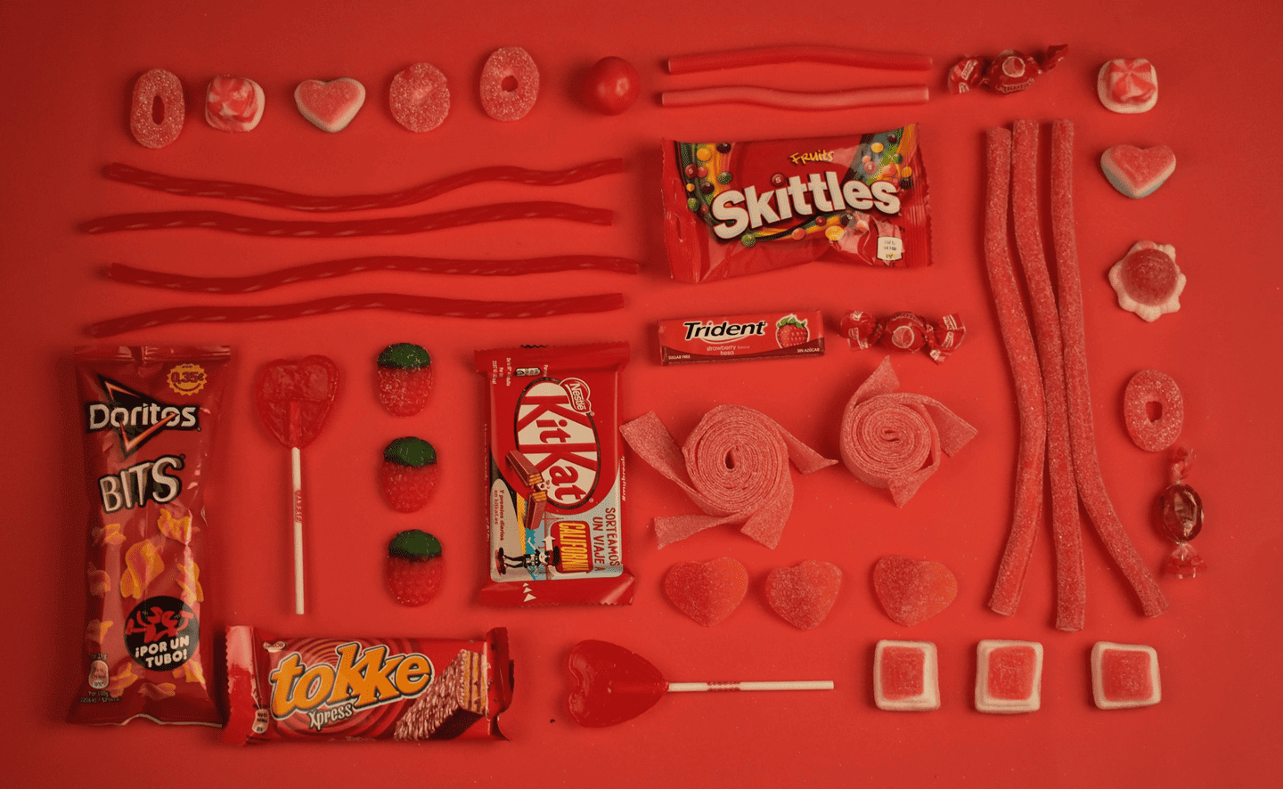
Blue – Trust, reliability, calm, professionalism
Popular among tech, finance, and healthcare brands (e.g., Facebook, PayPal)
Yellow – Optimism, happiness, caution
Great for brands aiming to be playful and energetic (e.g., McDonald’s, Snapchat)
Green – Nature, growth, health, balance
Significant in the wellness, eco-friendly, and financial industries (e.g., Whole Foods, Spotify)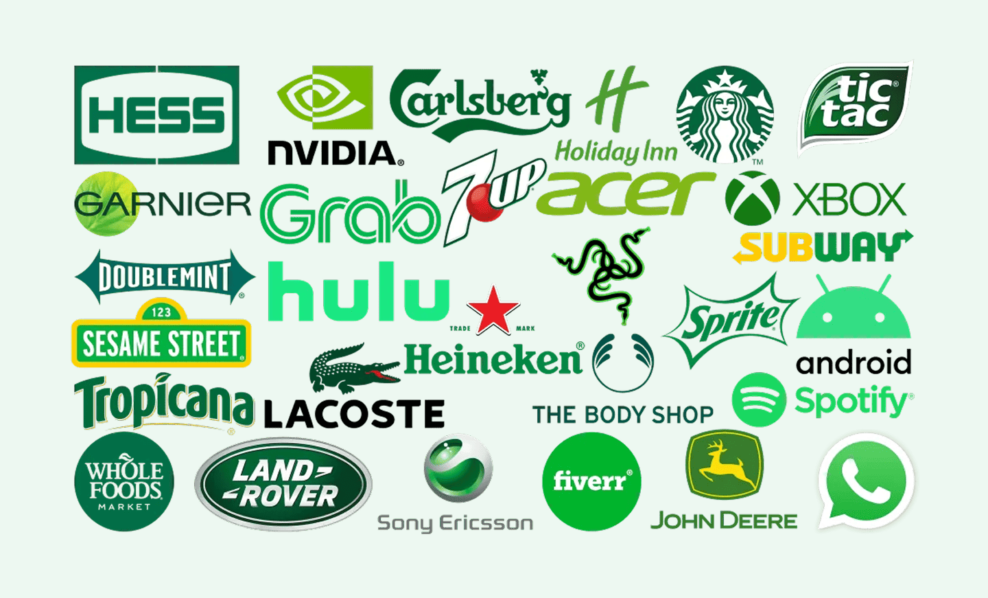
Orange – Creativity, friendliness, energy
Used to appear bold, fun, and confident (e.g., Fanta, SoundCloud)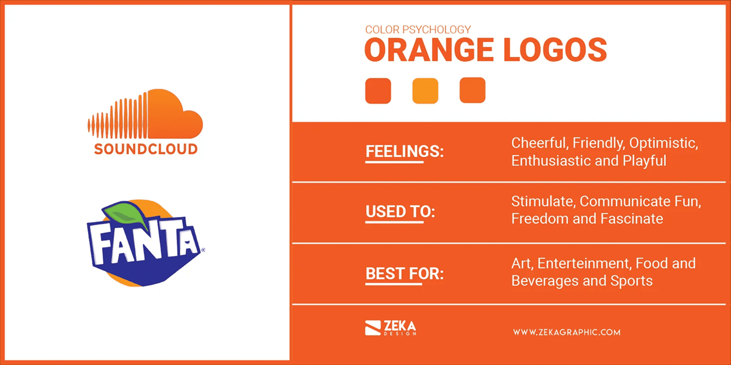
Purple – Luxury, wisdom, imagination
Ideal for premium or spiritual brands (e.g., Hallmark, Cadbury)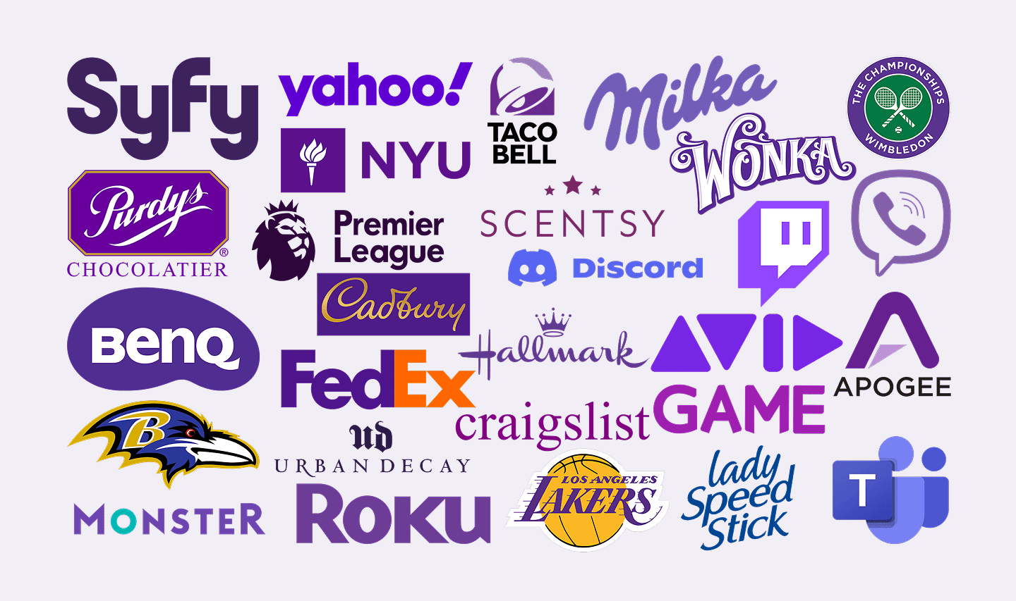
Black – Sophistication, authority, elegance
Preferred by high-end and stylish brands (e.g., Chanel, Nike)
White – Simplicity, purity, cleanliness
Common in minimalist and health-oriented branding (e.g., Apple, Dove)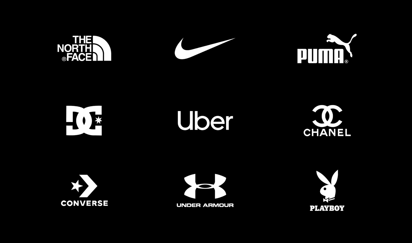
Pink – Femininity, playfulness, compassion
Often used in beauty, lifestyle, and baby-related brands (e.g., Barbie, Glossier)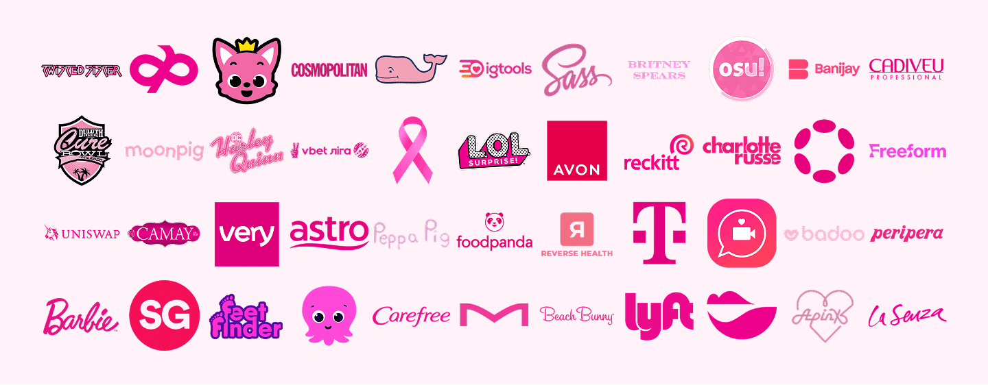
Cultural Context & Audience Perception
Color doesn’t mean the same thing to everyone, its interpretation can shift dramatically depending on cultural background, personal experiences, and even regional trends.
In some Eastern traditions, white is connected with grief, yet in Western societies, it represents purity. In a similar vein, crimson can represent festivity and good fortune in China but danger or caution in other places.
That’s why understanding your audience’s cultural lens is essential before finalizing your brand colors.
Examples of cultural differences in color perception:
Red:
• Western: Passion, danger, excitement
• China/India: Prosperity, celebration, good fortune
White:
• Western: Cleanliness, simplicity, purity
• India/Japan: Mourning, death, spirituality
Green:
• Middle East: Fertility, luck, and Islam
• Western: Nature, growth, sustainability
Black:
• Western: Elegance or mourning
• African cultures: May represent maturity and masculinity
When creating a brand with a global or diverse audience, cultural color sensitivity isn’t just respectful but it can be a smart business.
Best Practices for Using Color in Branding
Choosing the right colors for your brand isn’t always easy. It goes beyond personal preference and requires aligning your brand colors with your target audience. Strategic thinking is essential. Take into account these best practices when using color in your branding to make sure that your selections complement your brand identity, connect with your target audience, and elicit the appropriate emotional response. Below is a list of best practices that can help elevate your brand:
- Understand Your Brand Personality:
Make sure the colors you choose visually reflect the personality and key values of your business. Vibrant hues like orange and yellow could work well for a brand that is lighthearted and lively. Deep colors like gold or black can be more appropriate if your brand is luxury.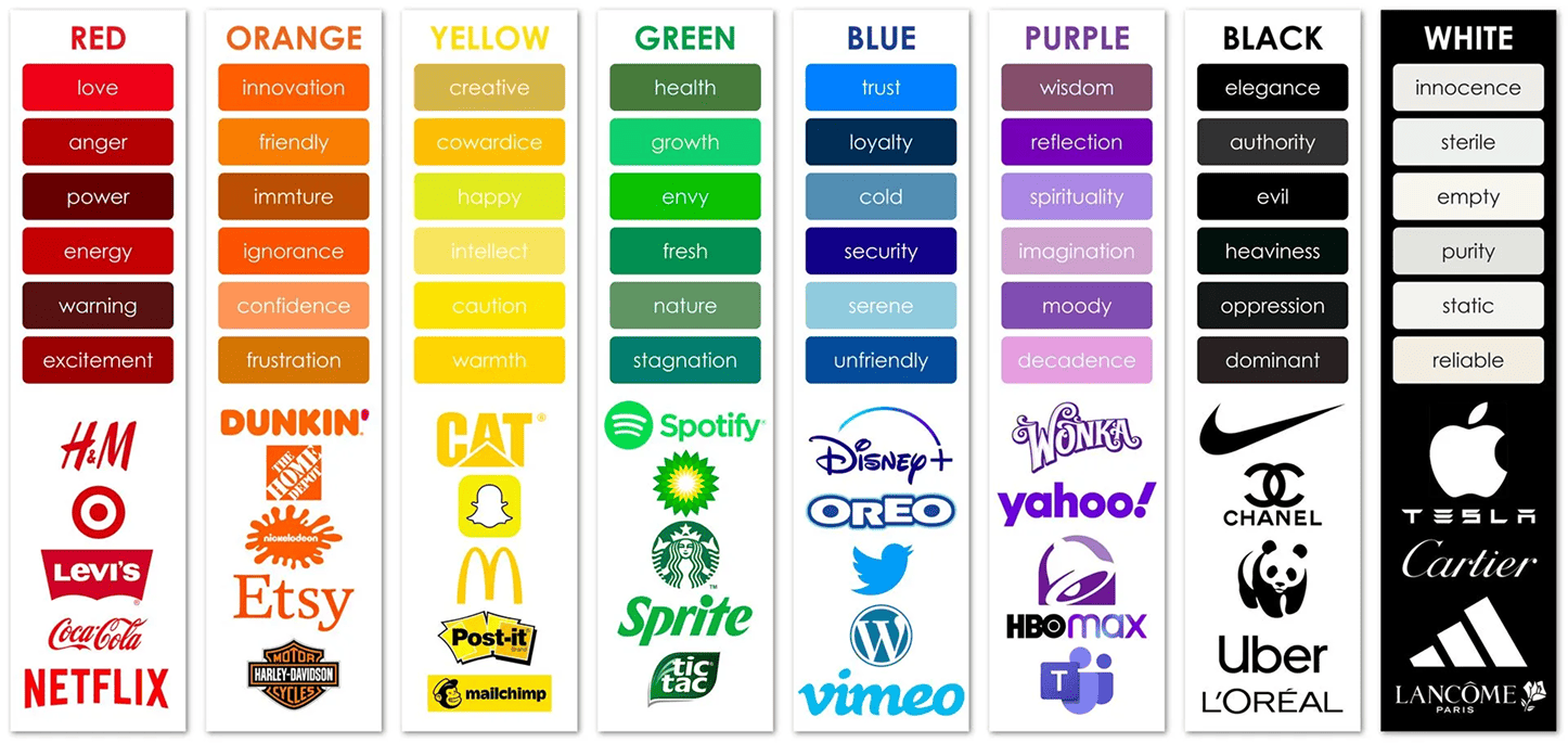
- Prioritize Simplicity:
Keep your color palette simple and consistent. Using too many colors might confuse consumers and weaken the identity of your brand. For balance, pick two to three basic colors and one or two secondary accent colors.
- Test Color Combinations:
Different colors look good together or can complement each other better than others. Before finalizing your palette, test color combinations to ensure they create the desired impact both visually and emotionally.
- Consider Color Accessibility:
Ensuring that your color choices are accessible to all users, including those with color blindness. Tools like contrast checkers can help ensure your content is readable by everyone.
- Adapt for Cultural Sensitivity:
Be mindful of how your color choices will be perceived in different markets. If your brand plans to go global, it’s important to research cultural color meanings and make adjustments as needed.
- Consistency Across Channels:
Maintain consistent color usage across all branding materials from your website to your social media profiles and print ads. Consistency in color reinforces brand recognition and trust.
Make Color Work for Your Brand
As we have seen in the blog, how the right colors for your brand can transform the way your audience perceives you. Therefore, by understanding the psychology of color, considering cultural differences, and applying best practices, you can make color a powerful tool in building a memorable and impactful brand identity. Remember, it’s not just about what looks good, it’s about what feels right for your brand and resonates with your audience on a deeper level.
Are you ready to choose the perfect color palette for your brand? Get in touch with us today, and let’s create a color strategy that speaks to your audience and enhances your brand’s story!